Bitcoin Distribution
This post intends to showcase Bitcoin's adoption by examining it through the lens of Bitcoin distribution.
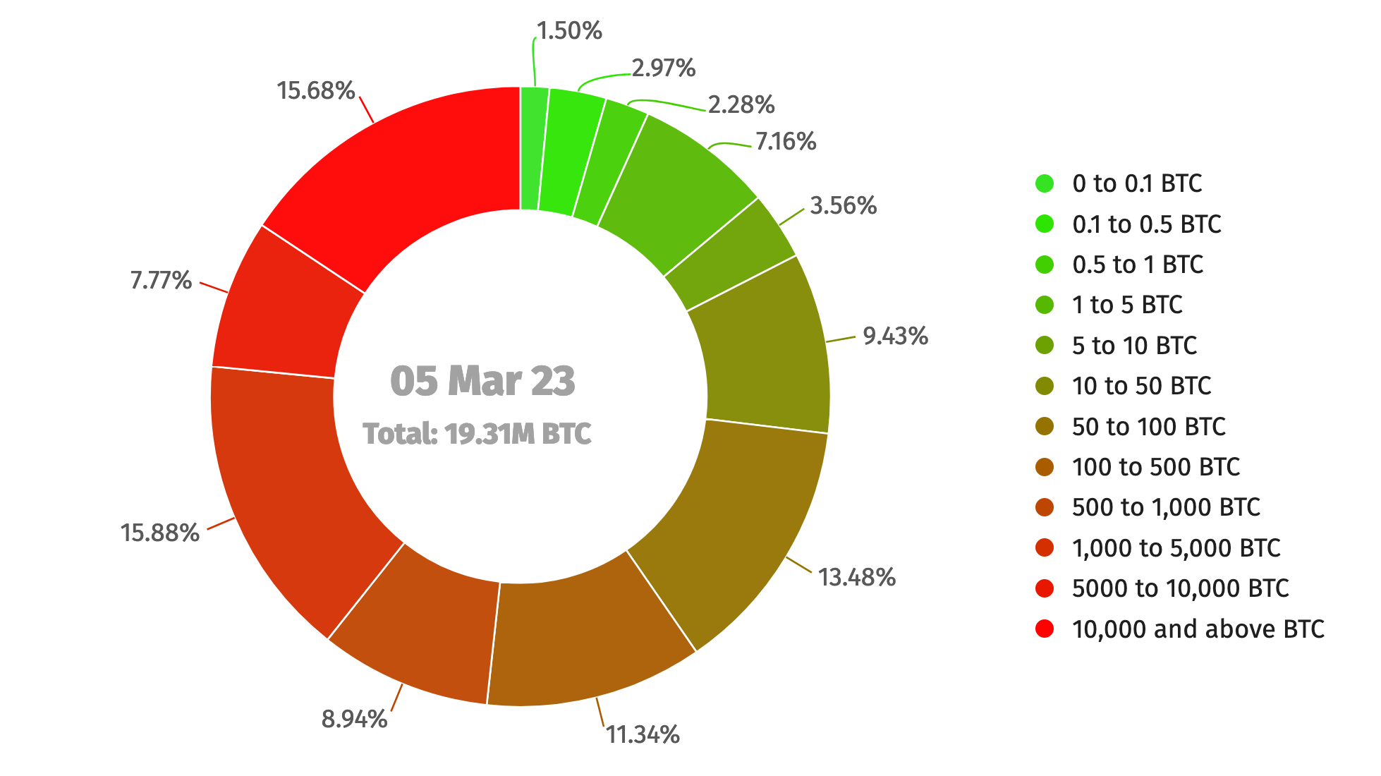
Current BTC Distribution
The image below illustrates how the distribution of BTC is determined by calculating the total value of unspent outputs across all addresses categorized based on the amount of BTC held, ranging from less than 0.1 BTC to 10,000 BTC or more.
To gain a better feel of BTC's adoption, we have created an animation that depicts the progression of BTC distribution over time. You can view the animation using this link.
What would mass adoption look like?
Disclaimer: The data presented below is intended to serve as a reference only. Its sole purpose is to provide an indication of what the distribution might resemble.
Assuming we only consider the wealth distribution of the United States, the table below displays the quantity of Bitcoin that individuals would possess based on their wealth.
|
Wealth Ranges |
Wealth Owned |
Wealth Equivalent in BTC |
Average Wealth/person |
|
top 1% |
30% |
6M BTC |
1.78 BTC |
|
90%-99% |
37% |
7.4M BTC |
0.25 BTC |
|
50%-90% |
28% |
4.7M BTC |
42.5 mBTC |
|
bottom 50% |
3.3% |
600K BTC |
3.5 mBTC |
US wealth distribution data was taken from Statista
My takeaways:
- I find it surprising that, if mass adoption occurs, owning 0.25 BTC is going to be considered a big deal because only the people in the top 10% will be able to afford it
- It still seems like it is still early on the adoption curve. I expect to see a lot more green on the distribution pie chart if mass adoption occurs.